Metro Design Guide
Taipei sets the standard for simplicity, convenience, cost.
Metro systems are typically assessed and ranked in terms of the frequency of their service, the number of passengers served, the number of stations, and the length of track. Alternatively, travel guides and news websites take an alternative approach, often emphasising the heritage beauty of systems like Moscow or London. This is all very well, but few cities can usefully measure their system against Tokyo (pop. 37m), or compete with the heritage brickwork of the world’s first underground.
The lack of an acknowledged standard for design and service delivery means decision-makers and the public have little to go on in terms of properly calibrating their expectations of what can be delivered for a given cost. As we’ll see, Taipei Metro operates near the frontier of service and convenience, and can usefully set the standard for other cities to emulate or attempt to better. It’s not perfect, it can be a little bland at times, but it’s fast, cheap, extremely easy to navigate, and staggeringly, is all delivered with a small operational surplus1.
The key to these achievements is a simple and consistent design that’s both extremely legible and easy to maintain. Let’s take a ride:
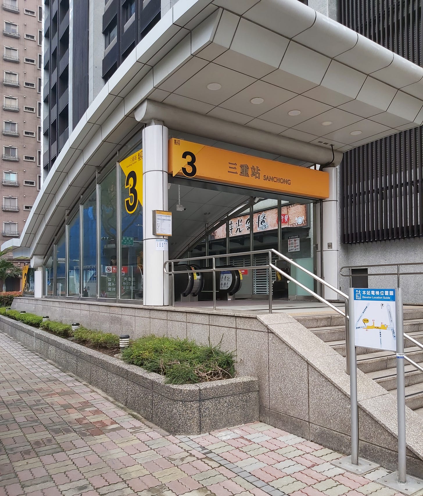
Signage is bilingual and always uses the same font and colour, to the point where third-party ads for an event will use the same visual language (e.g. directing people to an event near Exit 3, Sanchong Station). To the right of the image, we see a map of other entrances, including directions to a nearby elevator for mobility-impaired users. Night lighting is bright and illuminating, highlighting the entrance as a landmark from afar, and flooding the key surrounding features (stairs, signage, etc.) without ever being directed into people’s eyes or creating glare.
Down the escalator, we’re immediately greeted by a large, high-contrast and easy-to-read bilingual map of the station and its various locations of interest, as well as a map of the entire metro system. For those leaving the station (approaching from left of image, moving towards escalators on right) there’s a live feed of bus arrivals to the stop outside, allowing people to hurry if their bus transfer is about to arrive.
Lighting is consistently bright throughout the system, with a gradient at entrances to allow people to adjust to ambient lighting when exiting/entering the station.
Like with most modern public transport systems tap-on-tap-off preloaded cards (EasyCard) that streamline the payment process, reduce queue times, etc. Every station is also equipped with ATMs, and banks of ticket machines. These are always prominently located next to every set of entry/exit gates, making it easy for tourists or people who’ve forgotten or run out of credit on their card, no matter how unfamiliar they might be with the station.
Ticketing is by ride value, not station, avoiding the hassle of having to select your destination from a long list. One just looks at the map above the machine to determine the cost of your ride, pushes the button corresponding to that amount, pays, and then collects your ticket. If you want to buy multiple tickets (e.g. for a group, or your return later), that’s as easy as one extra tap on a big wide button. It's extremely simple and intuitive compared to many other systems (we’ll get to these counter-examples next time).
The fare gates are extremely simple - tap with your TPass or single-use ticket coin (depositing the latter in a little slot in the gate at the end of your journey), and the gates open. Double-wide gates for wheelchairs are positioned at every entrance/exit. Booths positioned at the boundary can be approached from every direction, and provide security, information, brochures, TPass top-ups, and a backup option for riders seeking single-use tickets.
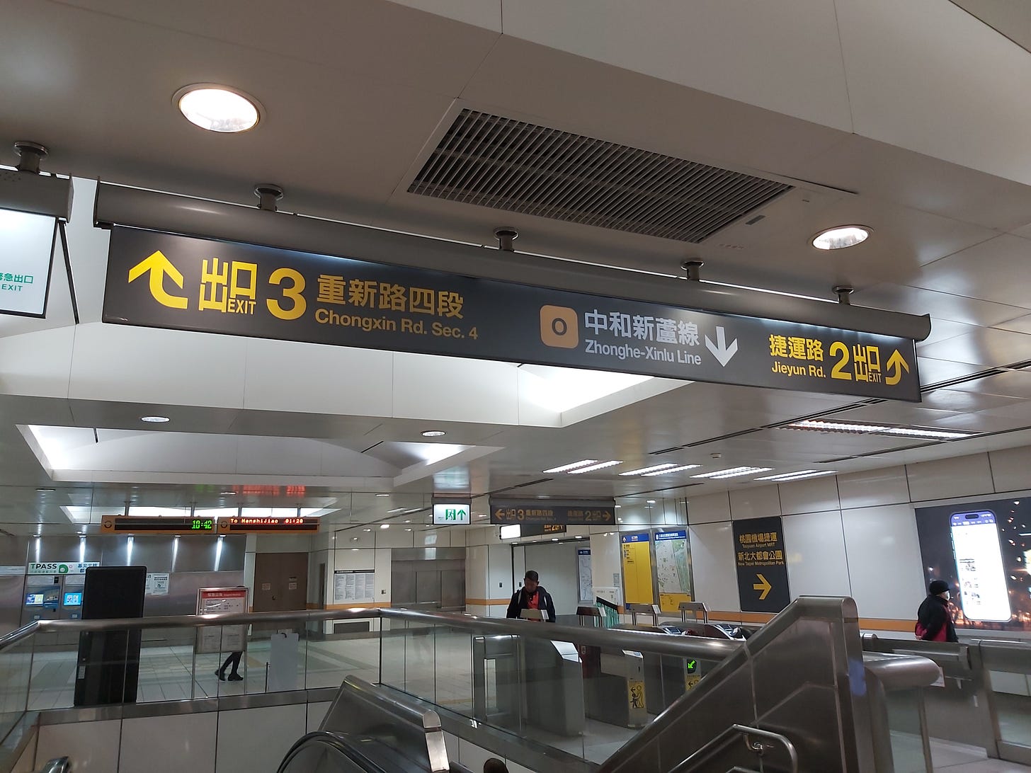
As you’ll notice signage is consistent and regular. Every potential decision point for a confused tourist looking to get to exit 2 is clearly signposted. Take a right from here and through the exit gates, you’ll immediately see another sign pointing towards the exit on the right, which itself will always confirm you’re on the right track. Wherever you’re going - just follow the signs.
Other features worth noting here include the live update signage on the middle left letting people know how far away incoming trains are, an ever-present map on the far wall (in this case providing a map of the local area above the station, and positioned for exiting passengers), and the subtle but consistent orange theming of this orange-line station.
On the platform, the situation is as you’re probably now coming to expect. Clear, high-contrast, bilingual signage. Route maps, live updates, orange line colouring. A small red light above each door flashes as the train approaches while a pleasant jingle plays at a comfortable volume, attracting the attention of people who’re otherwise able to zone out, chat with their friends, or use their phones without any concern of missing their train. That said, seating is highly limited throughout Taipei's stations, and could easily be doubled or better in most locations without cluttering the existing layout.
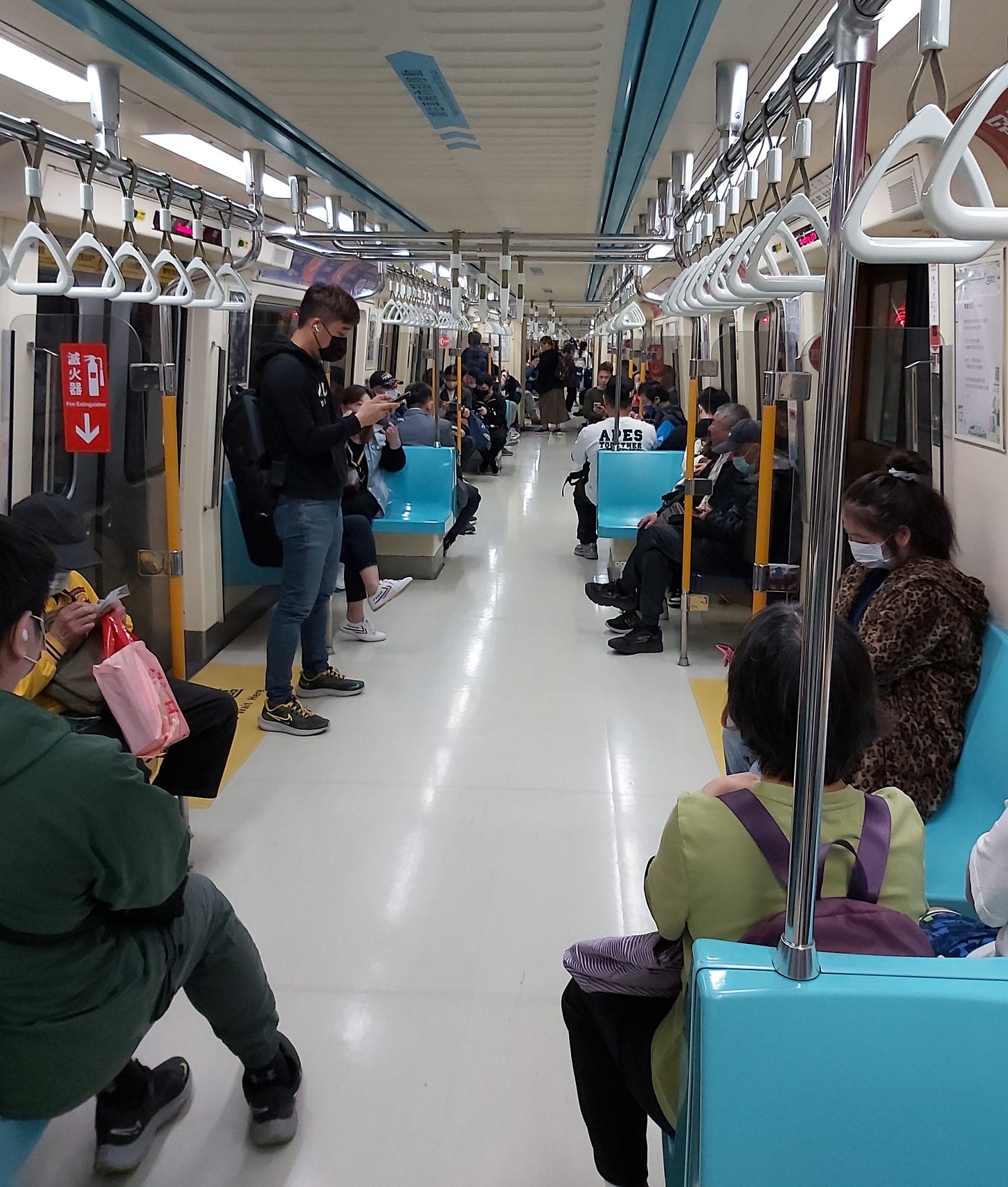
Onboard, we see the same design philosophy in action. A simple and consistent design. Signage is frequent, and colour instantly conveys meaning. All below-ground trains are the same, and considerable effort has been made to create a consistent design language with the raised-platform above-ground trains.
One minor issue here is that since people cluster near the exits, the live display can sometimes be obscured. Since there are few visual cues in an underground network, one can occasionally lose track of the train’s location if you’ve become crowded in on an unfamiliar route and you happen to miss the audio announcement. It’s a problem that could be addressed by introducing an additional live display between train exits. It’s a rare flaw that proves the rule of the otherwise easy user experience.
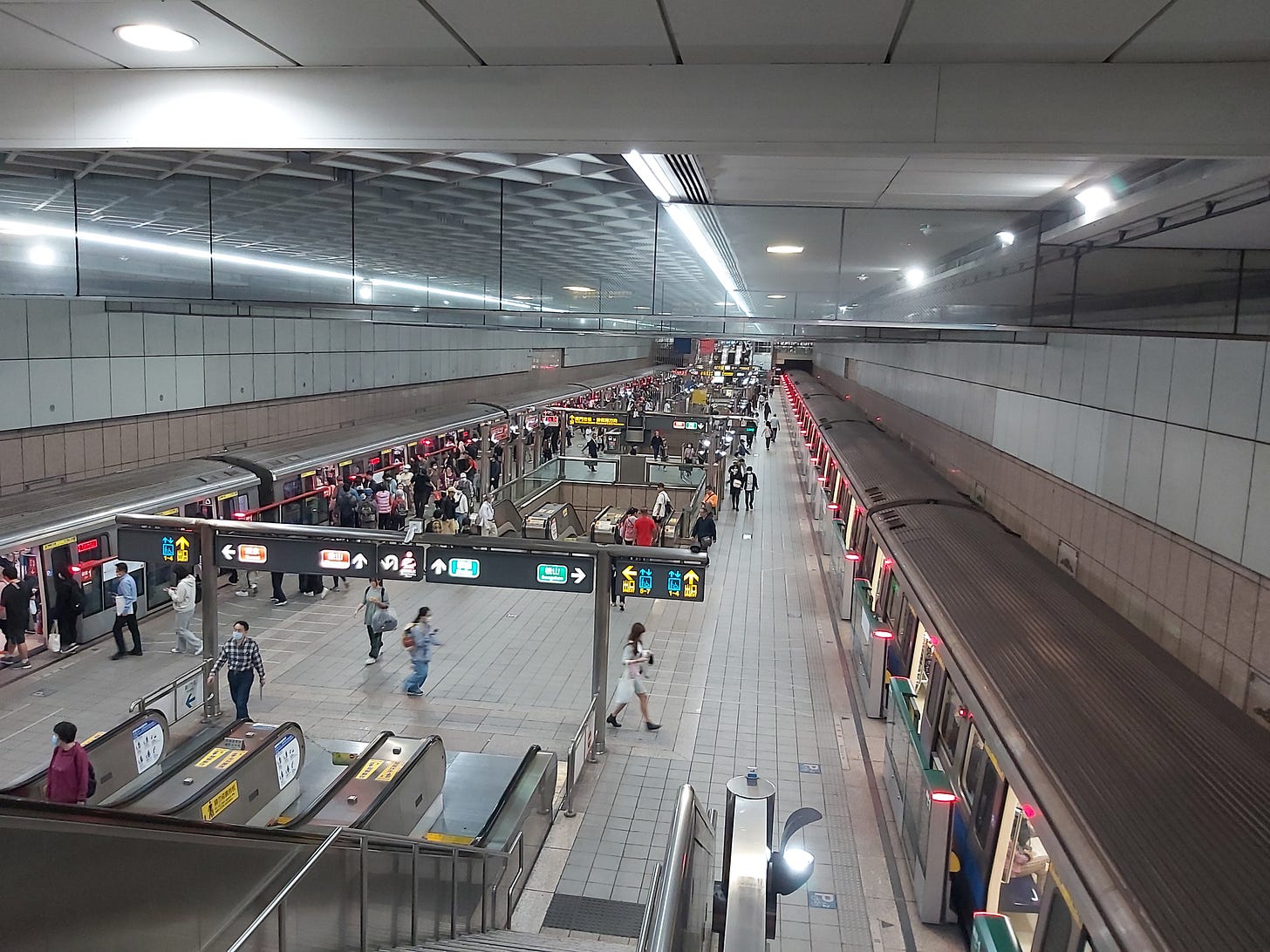
Taipei’s transfer stations are an understated marvel. Wherever lines intersect in parallel, the directions are split across levels, enabling transfer between lines as simply as walking across the platform and into your new train.
It’s a simple idea, but its accomplishment is an extraordinary feat of planning and engineering. The idea would have needed to be enshrined in not only the original design of the station but also in the design of the lines themselves so that the tunnels could be properly aligned in all three dimensions.
The standard station design involves a relatively simple split - parallel tracks will diverge horizontally to ‘wrap’ around the platforms. The Taipei design involves the tracks splitting vertically while bringing them into horizontal alignment to be ‘stacked atop’ each other for visual clarity of the station.
It’s a simple enough idea conceptually, but as any tunnelling engineer will tell you, messing around with line depths like this adds considerable complication to construction at both ends of the station. That it was done anyway speaks volumes about Taipei's confidence in its engineers, as well as its willingness to invest upfront in order to save people a small amount of time and effort for as long as these lines continue to operate2.
Use of the same non-slip floor tiles, plain architecture, and consistent colour scheme may help users navigate the system, though do mean the Taipei Metro will never be as visually stunning as Moscow. That said, the simple design and muted base colours do provide a great canvas for a range of wonderful artwork, such as sculptures, paintings, mozaics, and photo exhibitions, as you can see above.
Grand architecture has its place, but mediocre architecture does not. Taipei’s design philosophy not only provides a more visually interesting experience than most, it also does so at far lower cost than almost anywhere. When every station uses the same tiling, escalators, paint, gates, sensors, and so on: maintenance is easy to schedule, parts can be ordered in bulk, and operating costs are world-class. Where most public transport systems rely on enormous public subsidies, Taipei Metro returns an operating profit, joining Hong Kong3, Singapore, and some Japanese lines as the only metros to achieve such a surplus.
Metro systems are a great example of a public good, and a significant part of the value they create accrues to non-users in the form of lower traffic congestion, better air quality, lower carbon emissions, enabling greater housing density, and broader economic benefits resulting from improved transportation links (e.g. for better connected commercial outlets). Subsidies are clearly justifiable, but can often enable complacency given the absence of strong commercial drivers or competition.
Public spending represents public cost, and is obviously not unlimited - economically or politically. Public transport systems are typically tremendously expensive, often running at a third or more of city government spending. At these levels, public appetite for expansion will always be mixed at best. Raising our standards to that of Taipei’s would free up considerable funding, build public confidence, and enable a huge expansion in the value these systems create, such as through new lines or more frequent services.
If we’re to have any hope of meeting such standards, it’ll require a much greater level of focus on maximising the primary objective of convenience at cost than we typically see in the Western public sector4. If our organisations can reorient in such a way, then we’d be wise to skip decades of ‘lessons learned’, and simply copy Taipei’s approach.
Although the specifics of how the metric is accounted differ from one jurisdiction to another, annual revenue from ticket sales typically covers about 30-60% of annual operating expenses outside of East Asia. These figures tend towards the lower end of the range in the US (with many systems as low as 5-10%), and towards the higher end in Europe and in denser cities in general.
Note this is only practical on lines that intersect at near-parallels. Otherwise, passengers would collectively lose more time aligning the trains than the minority would gain during the easier transfer.
Another minor note - in splitting the lines, considerable thought has been put to which transfers are likely to be most popular. For example, those who’ve been Southbound on the red line in the image above typically want to continue their journey in the same general direction on the green, rather than head back to the North-West. These sorts of little considerations are easy to miss but are common throughout the Taipei Metro. From the perspective of the user, everything is simple and intuitive - as it should be.
Hong Kong benefits from an interesting funding model where a proportion of the increased land values caused by the provision of a new metro line to an area accrues to the Metro service. This mechanism for value capture makes them the only metro in the world to also cover capital expenses. It’s a model that, on the surface, deserves greater consideration and more widespread use. I’m interested to hear from readers with insight into this.
Indeed it’s not always evident in Taiwanese public facilities either, with competing priorities across different levels and parts of government sometimes creating what my wife and I semi-affectionately call ‘maintenance hells’ - particularly in the municipal swimming pools, as we’ll see in a future post.


Thank you for sharing. That is indeed a beautiful metro system. Simplicity is best.